Something Different - our TEDx Amoskeag Millyard Experience

Recently we were asked to participate in the planning and designing of the stage for an independent TEDx event in Manchester New Hampshire. What is TED you might ask? TED is a nonprofit devoted to Ideas Worth Spreading. It started out (in 1984) as a conference bringing together people from three worlds: Technology, Entertainment, Design. Since then its scope has become ever broader. Along with two annual conferences — the TED Conference in Long Beach and Palm Springs each spring, and the TEDGlobal conference in Edinburgh UK each summer — TED includes the award-winning TEDTalks video site, the Open Translation Project and TED Conversations, the inspiring TED Fellows and TEDx programs, and the annual TED Prize.

The event we participated in is called TEDxAmoskeagMillyard, where x = independently organized TED event. At our TEDxAmoskeagMillyard event, TEDTalks video and live speakers will combine to spark deep discussion and connection in a small group. The TED Conference provides general guidance for the TEDx program, but individual TEDx events, including ours, are self-organized.

This years theme was innovation through collaboration and the talks were nothing short of fascinating. We could not believe some of the incredible achievements made by people in our own backyard. The day was inspiring and as well as being educational. We cannot wait to be involved again next year.

Here are some photos of our stage creation....

It's not about what you want to hear.....

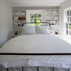
Often times when we meet with sellers they have ideas of what will make their home sell faster. Unfortunately, a lot of times these ideas are wrong. Just like with any kind of marketing, there is some real strategy behind our advice. We recently lost the opportunity to work with a seller because we refused to put a bed in the second bedroom of his condo. Why you ask? Because we subscribe to the theory that you are either helping yourself, or hurting yourself, when marketing your home. There is no grey area.

So why not a bed? Well this room was small and had a tricky layout. Sure a twin bed would have fit in there fine, but who wants a twin in their guest room at any price point? A twin really made the point that a larger bed would absolutely not fit. A larger bed would have prohibited the use of a nightstand and would have made it so the closet door would not open. This, my friends, does not sell homes. Buyers want flexibility...open rooms....options. Showing them how they cannot decorate rooms does not help sell a home.

What we wanted to do was stage the room as an office. An office provides for a lot of open floor space and enough furniture to make the room feel full and thoughtfully designed. An office with a pull-out couch is a great option that provides for a ton of flexibility.

We know it is really hard to go outside your comfort zone and implement ideas that you think sound crazy or don't seem to look right to you. But I find that it is when I step outside my comfort zone that the real magic happens.

So what do you think of the bed in the too small room?

Does Ray Allen Need to Stage His Home?

Former Celtics star Ray Allen is in a far worse place - well worse as far as teams go but perhaps better climate-wise. We can debate that later. He has, however, left his Wellesley mansion, where he has lived since joining the team in 2007, all 11,093 square feet of it: nine bedrooms, nine and a half bathrooms, four stories on 1.44 acres, a wood-paneled library, a media room that seats 12 comfortably, a six-car garage, parking for as many as 10 vehicles, and a grand foyer. Get out your checkbook kids, this place is all yours for $5.2 million. So, does having an amazing house and celebrity status mean you can opt out of staging? We say no.....and here is why.

We have toured several homes of this size and overwhelming is the word that comes to mind. The echos caused bare hardwood and empty rooms do not help make a house like this feel cozy. Many buyers struggle to think how they would decorate a seemingly unending number of very large rooms. How do you make a house this size feel like home? Sure it is fun at first but then it just becomes a challenge. We have had clients with homes of this size that lived with empty rooms because they simply could not figure out how to make them work.....and that is how staging sells a property - we show you how this could be your home.

Here are some photos and thoughts of his incredible property.....

This exterior is impressive. So no pressure to make the interior equally as impressive - right?

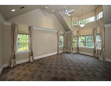
This is a lovely room, very large. We are assuming it is a bedroom. How would you decorate a room of this size?

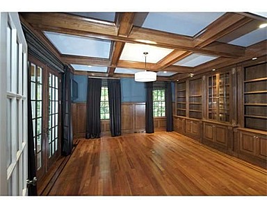
This room is nothing short of spectacular. We love the paneling and the bookshelves. Everyone loves the idea of a library - but how do you make it work for you?

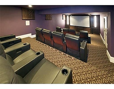
We agree, this room sells itself!!!

Update Your Fridge with Spray Paint!

Buyers love updated kitchens. However, we often see homes with kitchens that are mostly updated except for a rogue fridge in the wrong color. So what can you do? SPRAY PAINT!!! (I really wish I could shout that out because it is just so awesome). So the solution is to spray paint your fridge. Truly....it works and it is awesome. You do need to purchase a specific type of spray paint. It looks like this --->

I have never done it myself. I have, however, had clients who did it and were thrilled. So I found a blog with detailed instructions on how to do it right. You can see that here: Sassy Style - How to spray paint your fridge blog

Good luck and let us know how it goes!

Buyers Can See Beyond My Stuff.....

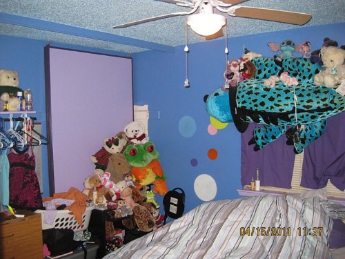
I think this might be one of my favorite objections from home sellers. Unfortunately, it is simply not true. I see people put more effort into listing a pair of shoes on ebay than some home owners do listing their home. The truth is only 10% of buyers can see "beyond your stuff". But just for argument's sake... let's play a little game. I am going to post a few pictures below of homes with "stuff" and you tell me if you think you can see the diamond in the ruff. Just for the record, these are REAL listing photos. This is a lovely bedroom, right? Spacious? Well-maintained? Nice carpet?

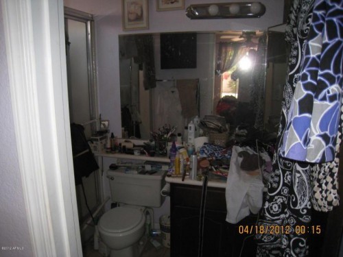
Okay, then surely this bathroom is acceptable... You can see that surely you could fit a lot of your stuff in there, right?

Here is a home with owners who clearly have their own sense of style. And why not? Everyone should be able to express themselves at home. You can see what a fantastic space this could be, right?

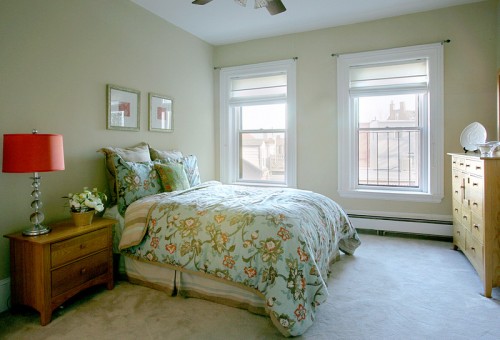
Since buyers can see beyond "stuff" this photo below should not be any more appealing than the ones above, right?

Even if buyers can see beyond your "stuff", the truth is you are moving. At some point during the selling process you will have to start packing your things. Why not start before you list and have a huge head start and the added bonus of a house that looks great?

Boston and all of it's Challenges

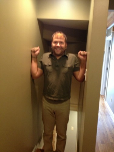
Working in Boston means you are constantly learning something new. Because our amazing city is a combination of old meets new we face a lot of unique challenges like narrow streets, tight staircases, tiny elevators, creepy dirt basements, and strict security requirements in luxury buildings. We have encountered enough of these dilemmas in our day and now ask a LOT of questions, but that does not save us from the occasional surprise. We recently did a project in Charlestown in a gorgeous single family home with a lot of character. It also had really narrow hallways. So I thought I would take this opportunity to show you a photo so you can see what I mean by narrow. While I don't love surprises, I do love this town so I will take all of its challenges any day.

It's curtain time!

Guest blog by Amber Jodoin: Greetings from Violet and the Bean! I am honored to blog about a recent DIY decorating project my wonderfully talented friend, Julie Chrissis, recommended I try in regards to a curtain dilemma I had been having. Our new digs have a total of 19 windows. Six of those windows are in the dining room and front parlor. The two rooms are open to each other, but clearly divided by beautiful turn of the century columns. It's been a long while since I have had lots of windows. Our little condo only had three and each was in a completely different room; I didn't have to worry about flow or matching.
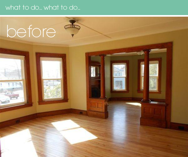
We have been here for just over two months now. And for about the first eight weeks, we lived with bare naked windows. I didn't want to just run out and buy whatever was on sale for the sake of having curtains. I really love the look of full length drapes, but of course with those, like most things, comes a very hefty price tag. Even the more affordable drapes run about $20 per panel.

My first thought was to buy inexpensive fabric and sew some lined drapes. I went to the fabric store and picked up some muslin and white lining and made a test pair of curtains. They came out wonderfully, but I am not all that skilled at sewing (I can do it, it just takes me a loooong time.) Three hours later, I had one pair of muslin curtains. They came out great and cost about $15 per panel. Given how much time it took me, not much of a savings. Five more windows at three hours each... ummm... yeah.. no.

Then I decided maybe I should just suck it up and buy the darned things. But honestly, I couldn't find anything I liked under about $35 per panel. I just couldn't cough up that much moola for rented windows.

I was still trying to figure out what to do, when my friend Julie, an interior designer and owner of Chrissis and Company Interiors, stopped in one morning. She was checking out the new space and I had mentioned my little dilemma. That is when she told me she had made curtains for her apartment out of drop clothes she got at Home Depot. The canvas fabric is basically the same color as a muslin - actually it is a little more brown which I actually prefer. It makes it easier for me to tie in the two rooms. At first I thought the natural color would be to much of a contrast on the sage green walls in the front parlor, but Julie assured me once I had the throw pillows, carpet and curtains in the room it wouldn't look stark at all.

Who am I to argue with a pro? Seriously - check out her work. She has created some beautiful interiors for premier properties in the Boston area.

So I head to the Home Depot pick up some drop cloths like this for $10.98 (but I had a coupon for 10% off):
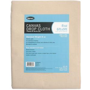
The drop clothes come in a wide variety of widths and lengths. I purchased 6' x 9' drop cloths to give me plenty of fabric to work with.

It took me about one hour per pair. I didn't take pictures of the process, but basically I cut the drop clothes in half and rolled and ironed a hem (Thank you to my sister and Becky O'Neil of Becky Oh! for teaching me the importance of ironing as you sew), and zipped a straight line to finish of the side. I measured where I wanted the hardware to be and the length I wanted to curtains (mine at 91" finished due to my fabulously high ceilings). Then I measured off about 4" at the top to create a rod pocket and did a simple 3" hem at the bottom.

I didn't bother with a lining - I may add one at a later point but the house has blown in insulation in the exterior walls, new windows that have be caulked with silicone and the land lord is insulating the between the joists in the basement. I don't think a lining will really make a difference at this point.

She also directed me to get window hardware from Christmas Tree Shoppe. I was a little hesitant because I had always associated CTS with a place to buy next years yard sale crap - but once again she did not steer me wrong. I picked up six rods and brackets for $3.99 each. Wooooo to the hooooo! Did I mention this girl is talented and smart??

So basically, each window cost me $13.87 complete with hardware. I feel like a rock star.. or at least I like I deserve a gold star.
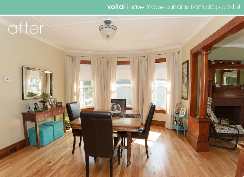
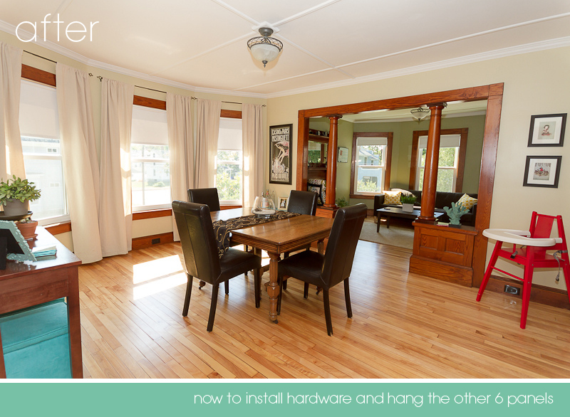
Of course, because we live in an old home, nothing is perfect. I'm not sure if you can tell from the photo or not - but the window casing closest to the fireplace abuts a wall and the left side of the casing is actually more narrow than the rest. Which means, we have to place the bracket up against the wall angle, remove the final and I will probably have to take at least one third off of one panel to "trick the eye" and stop the curtain from "creeping" too much into the actual window. C'est la vie!

Cheers and happy decorating! Amber Jodoin

Amber Jodoin was born at an early age and raised in New Hampshire. She has lived in various cities around the US and currently resides in New Hampshire with her husband and two daughters in a beautiful turn of the century home surrounded by maple trees and kamikaze squirrels. A formally trained graphic designer and photographer, as well as an interior design fan, avid blogger and an art nutter, she owns Sophie Bean Photography and specializes in modern children's portraiture, creative photography and urban landscapes. Her photographic work has been published in multiple issues of Time Life magazine as well as living rooms around the area. Visit her at on Flickr, Twitter, Facebook and read more about family, art and the randomness of life on Violet and the Bean.

It is Intentional

Today I met with an existing client and his real estate agent. It is a home we staged recently that we are adding some additional furniture to. While I was at the consult I could not help but stare at the living room wondering what the heck was going on. The furniture was all on top of each other and the "liveable space" of the room was cramped. And then it dawned on me..... someone had rearranged the room after we had staged it. I am not going to lie....this makes me mad.

So why am I mad you probably wonder. Sure the new arrangement worked - in the sense that the furniture still fit in the room. But it did not work in the sense that it made the room far less appealing to buyers. In fact, this new arrangement did a few things that really hurt the appearance of the room.

So what are the sins of the new arrangement?

1. Since this is the first room buyers see when walking in the front door we had wanted the room to seem open and inviting - the view now? A lovely 86" span of the back of a sofa. There is nothing inviting about that.

2. Secondly, this large expanse of upholstery now blocked the incredible marble fireplace that is the focal point of the room. You cannot even see the fireplace until you are well into the space now versus at the front door before. What a huge loss for the builder who took the time to create such a lovely feature in the room.

3. Whoever it was that rearranged this room did so in a way that involved moving all the furniture in about three feet - so that created a total loss of six feet of space. It felt cramped and tight even though there was a lot of room on the perimeter. A cramped and tight room does not sell a house.

So what is my point? My point is this...Every.Single.Detail in our staging is on purpose. We do this every day and there really is a method to our madness. We know it is difficult to embrace things when you do not understand how they work. But sometimes you just have to have some faith. We know our methods and ideas can seem whacky and but the result is always the same - they work.

What Do We Do?

People often ask me what it is we do. I always laugh and say that "we make things look pretty". Sure that is true and frankly, we are great at that. But often times it is really so much more than styling a home for sale.

Read More

Staging....a Metaphor for life?

We encounter a lot of different types of homeowners looking for help staging their home. I really think that the way people approach preparing their home for sale is likely the way they approach many things in their lives. To break it down into its simplest form, a home - for many homeowners, is likely their biggest asset and largest source of debt. It then stands to reason that a homeowner would want to do their best to make their home look its best at the time of the sale. There are real returns to be had from de-cluttering, restyling furniture, and having a thorough cleaning done. How much of a return you ask? Well, we have had clients list for more than their original market analysis antcipated. Here are a few examples: One for $5k more than planned, another $20k more, and one client listed for $100k more than his agent had originally planned. Not one of those clients did anything more than de-clutter and restyle.

Many homeowners accept the challenge, hunker down, and get the work done. They are not only rewarded typically with a higher sales price and fewer days on the market but with the added bonus of having started packing and purging which makes the moving process exponentially easier.

Other homeowners ask us for tricks and frankly I am always amazed by this. We are giving you the tricks. De-clutter and restyle your furniture. If you do it yourself, it is free. Sure you have to actually do the work but you would do it anyway, right? You are moving. If you are unable to do the work on your own, we understand and can help you connect with people who can help.

Just like most things in life, there is not a substitute for hard work and effort. If you put the effort in, you get the results. It really is that simple.